|
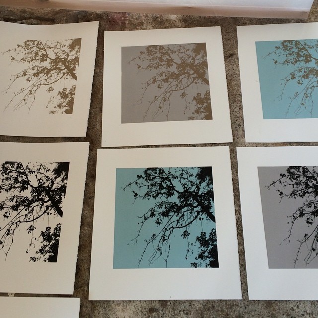
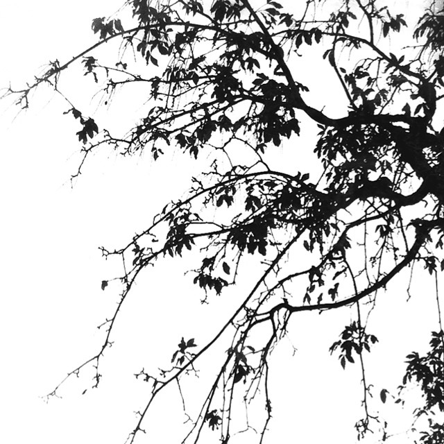
Yesterday was time for another visit to the screen printing studio of Pål Gunnæs. Since I'm in the process of learning to screen print, I wanted to experiment a little with different colors on both the motive and the background. I ended up with six different versions of the same motive; gold and black respectively on white background + on two different background colors - turquoise and grey. It's very hard to say which I like most and consequently should print a whole series of. I asked my Instagram friends and got so many different answers - maybe I
0 Comments
Leave a Reply. |
M A R I T S A X E G A A R D
Please enter your name if you want to be notified when there is a new blog post.
Information about my workshops here. See my paintings, drawings, etchings and watercolors here.
All
May 2016
See more pictures from last years workshop here
See my fineart photography here.
"Fine works of art never age, because they are marked by genuine feeling. The language of the passions, the impulses of the heart, are always the same."
Delacroix |






 RSS Feed